
The creative landscape is flooded with template-oriented solutions: web design, icons, etc. While there is a place for premade systems & imagery, these mass-produced solutions are lacking any distinguishing characteristics, a huge detriment to promoting your individual brand.
Yes, there are a few reasons to use mass-produced creative assets. First, ease of automation of not having to recreate the wheel when it does not warrant to do so. Also, in our App-driven technology, using mass icons that are widely recognized enables practical communication. But the cause for using templates are: budget restraints, the need for speed, and laziness. These actions produce complete neglect to the Brand.
Custom Design for Custom Goals
So, how do you make sure your Brand doesn’t become the next casualty? Stay away from cookie-cutter solutions. Template-derived designs deliver monogamous results. There’s nothing worse than your website looking like someone else’s, especially your competitor. A real Brand killer. Instead, develop and incorporate a unique visual language, customized for your brand. This begins at the foundation with corporate colors and the imperative use of fonts to distinguish your brand. Then evolves with custom templates, custom illustrations & standardized imagery, resulting in a fresh and distinct Brand identity.
_____
Solution: Develop a Unique Visual Language
Your Brand is your company essence, and it is what distinguishes you from your competition. By developing a visual language that is unique to your brand, these custom solutions can reap unseen benefits in promoting your identity.
Let’s go through an example of a brand developed from the ground-up in the Cross Design studio:
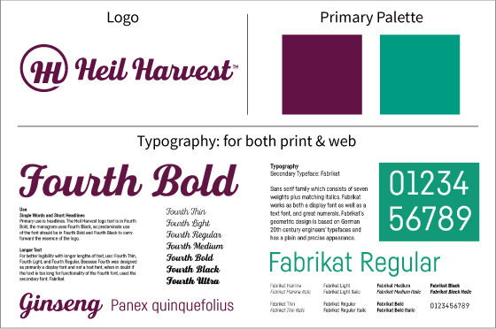
First: The base-brand foundation elements of the logo, primary color palette, and typography for both print and web.
Brand Primary Elements
Base-brand elements are: the logo, brand colors, and typography. So many times I see the use of website templates with no distinctive characteristics. Sure, the company logo and colors match the brand, but the template is like thousands of websites out on the web, with the site using “generic” fonts instead of employing brand-designated fonts. With web fonts services available like Adobe Typekit, there is no reason not to continue your typographical branding in your web presence. Use of your corporate typeface and the standardization of typographic treatments is a critical in continuing the recognition of your identity.
___
Second: Going Beyond Foundation Elements
So, what can we do that goes beyond the logo, color, and typography to furthermore your Brand’s Visual Language?
1. A Full Color Palette
Establishing secondary and tertiary color palette to compliment the primary is another fundamental need. Much of the time companies only go as far as a primary color palette and then randomly dispense additional colors to their marketing materials. The color palette is a key reflection of your company character, and continues the brand recognition through consistent use. Creating palettes are not done haphazardly, but should establish color combination that are both based of color theory as well as the personality of your brand. Like all branding elements, repetitive use of these secondary color palettes assist in the retelling of your brand.

2. Employing Distinct Graphic Styles
Move away from cookie-cutter graphics and employ an exclusive graphic style to elevate your brand. This graphic style should be consistent throughout through all the imagery your engage to represent the brand, whether it is photography, illustrations, icons, etc.
Custom Illustration
Shown here is a custom illustration created by Cross Design to implement throughout the brand. 100% unique, no one else will have the same. The illustration show how it utilizes the secondary and tertiary palettes, which we speak of above. The style and employment of this illustration should go beyond the packaging shown, and integrate on all marketing collateral, becoming a secondary recognizable icon, that can identify the company.


Photography Styles
Define your photography for consistency. For Heil Harvest, we established that photography would have a prevailing white tone to emphasize the “white” in our brand. Photography for both products and featuring root grades are shown on a 10% grey background.

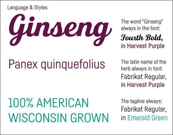
3. Language & Styles
The vibe you speak is also part of your brand. The voice you employ should match your primary audience and be integrated into your editorial style on web, packaging, digital, and print collateral. It is to your great advantage to establish brand styles that can be repeated for unmistakable distinction. Repetition, repetition, repetition.
4. Web
A customized web solution will assist to employ all your branding elements: grids, fonts, colors, and image and formatting styles on the web. The sample below brings together employments of the brand style guide for Heil Harvest, making it obvious that this website is part of the same brand family. Brand recognition prevails.

___
Conclusion
Build Upon Your Brand
Don’t let your Brand become stagnant. Integrate new graphic elements to your brand foundation keeps things fresh and current that builds upon the foundation and philosophy that you have already defined within your company essence. These unique elements will increase both your credibility and connect with your industry in an honest, real-time approach. By having a unique visual language, and not a copy-cat solution, you project honesty and integrity within the brand.
Personalize the Experience
If you are striving for new ways to assist in building the distinction of your brand, it is time to get off the cookie cutter band wagon and attract positive attention through noticeable custom solutions. By developing custom features within your Brand, you are tapping into the full potential of Brand development.
Stand-Out Your Brand: Think Unique, Think Custom